
This article explains how you can customize the look of Double the Donation’s plugins, including changing the background and font colors, as well as adjusting font size and style, using CSS overrides.
Changing the general plugin font size
Changing general plugin font family (This by default inherits your page font):
Remove the "Let's Check" button
Best Practices for Customizing Your Plugin
Understanding CSS Customization
The ability to customize the appearance of the matching gift plugin is an advanced feature that requires knowledge of CSS. CSS (Cascading Style Sheets) is used to control the layout and style of web pages, including elements such as fonts, colors, and sizes.
Common CSS Modifications:
Here are some of the most common customizations you can make using CSS:
-
Changing the General Plugin Font Size
-
Changing the General Plugin Font Family (This by default inherits your page's font)
-
Changing Button Colors
-
Changing Button Font Size
-
Removing the "Let's Check" Button
-
Changing Link Colors
These changes allow you to match the plugin's design to your website’s overall style.
This is advanced functionality that should only be used by organizations that have a web designer or web developer on their team.
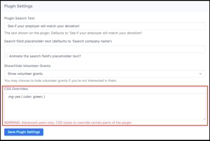
How to Add CSS to the Plugin
To customize the Double the Donation plugin appearance, you need to add CSS overrides in your account settings. Follow these steps:
-
Log into Your Double the Donation Account
-
Navigate to Plugin Settings:
-
In the matching module or volunteer module, go to Settings > Plugin Settings.
-
-
Find the CSS Overrides Section:
-
In the CSS Overrides field, enter the CSS code you want to apply to your plugin (such as font size, colors, or button styles).
-
Example:
You can add CSS like this to adjust the font size:
#dd-container {
  font-size: 20px !important; /* Change "20" to your desired font size */
}
Using the !important parameter ensures that your custom styles will override the default settings.
Common CSS Modifications Explained
1. Changing General Plugin Font Size
To adjust the font size of the plugin, you can use the following code:
#dd-container {
  font-size: 20px !important;
}
2. Changing General Plugin Font Family
To change the font family of the plugin, use:
#dd-container {
  font-family: "Helvetica Neue", Helvetica, Arial, sans-serif !important;
}
3. Changing Button Colors
To modify the button colors (including text color, border color, and background), use:
#dd-container .lets-check, #dd-container .mg-forms-button {
  color: #your-text-color-in-hex !important;
  border-color: #your-color-in-hex !important;
  background-color: #your-color-in-hex !important;
}
4. Changing Button Font Size
You can adjust the font size of the buttons by using:
#dd-container .lets-check, #dd-container .mg-forms-button {
  font-size: 13px !important; /* Change "13" to your desired size */
}
5. Removing the "Let's Check" Button
To remove the "Let's Check" button, use:
#dd-container .lets-check {
  display: none;
}
6. Changing Link Colors
To change the color of the links in the plugin, use:
#dd-container a {
  color: #your-color-in-hex !important;
}
These are the most common modifications to our plugin. If you wish to customize them further, please ask your web developer to use the Chrome DOM inspector to identify elements to be modified, and then add in the appropriate CSS customizations with styles starting with "#dd-container" as per the above examples.
Best Practices for Customizing Your Plugin
-
CSS Knowledge Required: These customizations are intended for organizations with web developers or those familiar with CSS. If you're unsure about the process, consult with your development team.
-
Avoid Overwhelming the Form: Make sure that the plugin customization doesn't disrupt the user experience. The plugin should remain intuitive and easy for donors to use.
If editing in the matching module: Make sure that the Plugin URL is entered, then add one of the above CSS modifications that you see above.